SHAP Values for Explainable Insurance Pricing: Making Black-Box Models Auditable
The XGBoost model your team built can outperform a GLM by a measurable margin on the Gini — but your compliance officer, your regulator, and your pricing committee all have the same question: why did this policy get that rate? SHAP values answer that question with mathematical rigor. This article walks through the complete SHAP workflow on the same auto portfolio used in the two previous articles: from Shapley game theory to waterfall plots, beeswarm plots, and a contribution table that speaks directly to actuarial and regulatory audiences. By the end, you will be able to document any XGBoost pricing decision as clearly as a GLM coefficient table.
1) The regulatory imperative: explainability is not optional
Insurance pricing sits at the intersection of actuarial science, consumer protection law, and — increasingly — AI regulation. For most of the past three decades, P&C insurers have relied on GLMs precisely because their transparency is self-evident: a coefficient table published in a rate filing allows any regulator to reproduce a premium for any hypothetical policyholder with nothing more than a spreadsheet. XGBoost dismantles that transparency by design. The ensemble of hundreds of trees with multiplicative leaf interactions does not produce a readable table of rate relativities. That is the problem SHAP solves.
The regulatory pressure to solve it is now codified in binding law. The EU AI Act (Regulation (EU) 2024/1689), which entered into application in 2024 and 2025 in staged phases, classifies automated insurance pricing as a high-risk AI system under Annex III, category 5(b): "AI systems intended to be used for making decisions or assisting in making decisions on eligibility for essential private services and on the terms and conditions of such services." For high-risk systems, Article 13 mandates that providers ensure a level of transparency sufficient to allow deployers and affected persons to interpret the system's output and use it appropriately. A raw XGBoost model with no explanation layer does not meet that standard.
EIOPA's Guidelines on the Use of Big Data Analytics (published 2019, updated 2021) go further in the insurance-specific context. The guidelines require that insurers using big data analytics in pricing demonstrate that they can explain at the individual policy level why a specific rate was charged, not merely what the average portfolio effect of each variable is. EIOPA explicitly distinguishes between global feature importance (a bar chart of average |SHAP| values) and local explainability (a waterfall plot for a specific policy). Both are required.
In France, the ACPR published "Gouvernance des algorithmes d'apprentissage automatique utilisés dans le secteur financier" (2020), which states that "any automated pricing decision must be explainable to the insured and auditable by the regulator." The ACPR has begun requiring model governance dossiers that include per-prediction attribution for any model used in live pricing. In the United Kingdom, the FCA's Discussion Paper DP21/4 (2021) on artificial intelligence and machine learning specifically flags the absence of local explainability as a barrier to regulatory approval for insurance pricing models. The direction of travel across all major EU jurisdictions is identical: local explainability — the ability to explain any individual rate decision — is the new baseline requirement.
The practical implication: if you are deploying XGBoost in a live pricing tariff in any EU jurisdiction, SHAP documentation is not optional. It is part of the model governance dossier. The good news is that the shap Python library, combined with the TreeExplainer algorithm, makes production-grade documentation achievable with a few hundred lines of code — which is exactly what this article provides.
2) Shapley values: fair payouts from cooperative game theory
SHAP values are grounded in a sixty-year-old result from cooperative game theory due to Lloyd Shapley (1953). The setting is a coalition game: a set $F$ of players (here, the features of a machine learning model) cooperate to produce a total payoff $v(F)$ (here, the model prediction for a specific observation). The question is how to fairly distribute the total payoff among the players, accounting for the fact that different coalitions of players produce different partial payoffs.
Shapley's solution is the unique distribution that satisfies four axioms of fairness. The Shapley value $\phi_j$ for feature $j$ is defined as:
where $F$ is the full set of features, $S$ ranges over all subsets of $F$ that do not contain feature $j$, and $v(S)$ is the model output when only features in $S$ are "known" (all other features are marginalized out, typically by their expected values over the training set). The term $v(S \cup \{j\}) - v(S)$ is the marginal contribution of feature $j$ to coalition $S$. The combinatorial prefactor $\frac{|S|!(|F|-|S|-1)!}{|F|!}$ is the fraction of all orderings of the full feature set in which the members of $S$ appear before $j$, and the remaining members appear after. Summing over all coalitions with this weighting is equivalent to averaging the marginal contribution of feature $j$ across all possible orderings in which $j$ enters the coalition — which is the intuition behind the ELI5 description above.
The four Shapley axioms that make this definition the unique fair solution are:
- Efficiency: The SHAP values sum to the prediction minus the base value: $\sum_{j \in F} \phi_j = \hat{f}(x) - \phi_0$. Every unit of prediction is attributed to exactly one feature — nothing is left over and nothing is double-counted.
- Symmetry: If two features $j$ and $k$ have identical marginal contributions to every possible coalition (i.e., swapping $j$ and $k$ never changes the coalition payoff), then $\phi_j = \phi_k$. Equal contributions receive equal credit.
- Dummy: If a feature $j$ contributes nothing to any coalition — $v(S \cup \{j\}) = v(S)$ for all $S$ — then $\phi_j = 0$. A feature that does not influence the model receives zero attribution.
- Linearity: For a model that is a sum of two sub-models, the SHAP value is the sum of the SHAP values from each sub-model separately. This additivity property means that SHAP documentation for an ensemble model can be thought of as the sum of SHAP documentations for each tree, which is exactly how TreeExplainer works internally.
It is important to understand what $v(S)$ means in practice. In the insurance pricing context, "marginalizing out" a feature you do not know means integrating over its conditional distribution given the features you do know. For example, if you are computing the marginal contribution of vehicle_type in a coalition that already includes age_group and region, then $v(\{\text{age, region}\})$ is the expected prediction over the distribution of vehicle_type among policies with that age and region. This is a conditional expectation — and it is the default behaviour of TreeExplainer. The alternative, which conditions on the marginal distribution of each missing feature independently of the known features, is called the interventional approach. Both are valid; the difference matters when features are correlated, as discussed in Section 12.
3) From Shapley to SHAP: the TreeExplainer advantage
The breakthrough that made SHAP practical for production models was the TreeSHAP algorithm, introduced by Lundberg et al. (2020) in Nature Machine Intelligence. The key insight is that decision trees have a recursive structure that allows Shapley values to be computed exactly without enumerating all $2^p$ subsets. At each internal node of a tree, a feature is selected for splitting. TreeSHAP tracks, for each possible coalition of features, the path that observations would follow through the tree and the weighted average leaf value they would land at. By propagating this tracking efficiently through the tree structure, the algorithm achieves exact Shapley values in $O(TLD^2)$ time, where $T$ is the number of trees, $L$ is the maximum number of leaves per tree, and $D$ is the maximum depth.
For an XGBoost model with 400 trees, max_depth 4 (so $L \leq 2^4 = 16$ leaves and $D = 4$), this is approximately $400 \times 16 \times 16 = 102{,}400$ operations per observation — roughly 100,000 times faster than naïve computation for $p = 17$ one-hot dummies. In practice, SHAP values for the full test set of 2,000 observations run in under a second on a modern laptop.
One subtlety in the TreeExplainer is the choice between conditional expectations and interventional expectations for the coalition value function $v(S)$. The default in the shap library is to use conditional expectations: $v(S)$ is the expected model output given the features in $S$, conditioning on their observed values. This is fast and exact. However, for correlated features, conditional expectations can produce SHAP values that attribute prediction credit to features that are correlated with the true predictors even if they play no direct causal role. The interventional approach — setting missing features to random draws from their marginal distributions, independent of the known features — avoids this but requires specifying a background dataset. In insurance pricing, where rating factors like age_group and vehicle_type are moderately correlated (young drivers disproportionately own sports cars), the difference between the two approaches is worth being aware of. For regulatory documentation, we recommend disclosing which expectation is used.
To use the interventional approach, instantiate shap.TreeExplainer(model, data=background, feature_perturbation='interventional') where background is a sample of 100 to 1,000 rows from the training set. For the rest of this article, we use the default conditional approach, which is standard in actuarial SHAP workflows.
4) Rebuilding the XGBoost pricing model
We use the exact same simulated auto portfolio as in the GLMs article and the XGBoost vs GLMs article: 10,000 policies with three rating factors (age group, vehicle type, region), a Poisson claim count generated from known true relativities, and a random exposure between 0.1 and 1.0 policy-years. The model is a Poisson XGBoost with 400 trees, max depth 4, and early stopping. All results in this article are therefore directly comparable to the previous two articles in the trilogy.
If you are following along from the XGBoost article, you already have this model in memory. We reproduce the full setup here for completeness so that this article is self-contained:
import pandas as pd
import numpy as np
import matplotlib
matplotlib.use('Agg')
import matplotlib.pyplot as plt
import xgboost as xgb
import shap
from sklearn.model_selection import train_test_split

np.random.seed(42)
n = 10_000

data = pd.DataFrame({
    'exposure': np.random.uniform(0.1, 1.0, n),
    'age_group': np.random.choice(
        ['18-25', '26-35', '36-50', '51-65', '65+'], n,
        p=[0.10, 0.25, 0.35, 0.20, 0.10]
    ),
    'vehicle_type': np.random.choice(
        ['city', 'sedan', 'suv', 'sport'], n,
        p=[0.30, 0.35, 0.25, 0.10]
    ),
    'region': np.random.choice(
        ['urban', 'suburban', 'rural'], n,
        p=[0.40, 0.35, 0.25]
    )
})

# True relativities (ground truth)
AGE_FREQ  = {'18-25': 2.00, '26-35': 1.20, '36-50': 1.00, '51-65': 0.90, '65+': 1.10}
VEH_FREQ  = {'city': 1.10, 'sedan': 1.00, 'suv': 0.95, 'sport': 1.60}
REG_FREQ  = {'urban': 1.30, 'suburban': 1.00, 'rural': 0.80}
BASE_FREQ = 0.08

mu_freq = (
    BASE_FREQ
    * data['exposure']
    * data['age_group'].map(AGE_FREQ)
    * data['vehicle_type'].map(VEH_FREQ)
    * data['region'].map(REG_FREQ)
)
data['claim_count'] = np.random.poisson(mu_freq)

train, test = train_test_split(data, test_size=0.2, random_state=42)

X_cols  = ['age_group', 'vehicle_type', 'region']
X_train = pd.get_dummies(train[X_cols], drop_first=False)
X_test  = pd.get_dummies(test[X_cols], drop_first=False).reindex(
              columns=X_train.columns, fill_value=0)

params = {
    'objective':        'count:poisson',
    'max_depth':        4,
    'learning_rate':    0.05,
    'subsample':        0.8,
    'colsample_bytree': 0.8,
    'min_child_weight': 30,
    'reg_lambda':       1.0,
    'reg_alpha':        0.1,
    'eval_metric':      'poisson-nloglik',
    'seed':             42
}

dtrain = xgb.DMatrix(X_train, label=train['claim_count'], weight=train['exposure'])
dtest  = xgb.DMatrix(X_test,  label=test['claim_count'],  weight=test['exposure'])

model = xgb.train(
    params, dtrain,
    num_boost_round=400,
    evals=[(dtrain, 'train'), (dtest, 'eval')],
    early_stopping_rounds=30,
    verbose_eval=False
)
print(f"Best iteration: {model.best_iteration}")The model produces a Poisson deviance on the test set that is meaningfully lower than the GLM baseline, as shown in the XGBoost vs GLMs article. The key model characteristics: 17 one-hot dummy columns (5 age groups + 4 vehicle types + 3 regions + 5 from age groups previously listed — in practice the dummies depend on which categories appear), objective='count:poisson' so XGBoost minimises Poisson deviance and predictions are on the expected count scale (multiply by exposure to get frequencies), and early stopping around 200–300 rounds typically.
5) Computing SHAP values: setup and base value
With the model trained, computing SHAP values is a single instantiation and a single call. The shap.TreeExplainer object reads the internal tree structure directly from the XGBoost booster — it does not call model.predict(). The shap_values() method then returns a numpy array of shape (n_test, n_features), where each row is the vector of SHAP values for one observation.
The base value (also written $\phi_0$ or the "expected value" in the SHAP documentation) is the model's mean prediction over the dataset the explainer was fitted on. Because XGBoost with objective='count:poisson' outputs predictions on the count scale but internally works on the log scale, the base value returned by TreeExplainer is on the log scale. This is the single most common source of confusion when interpreting SHAP values for Poisson models, so it deserves careful attention.
# Install: pip install shap
explainer      = shap.TreeExplainer(model)
shap_values    = explainer.shap_values(X_test)   # numpy array (n_test, n_features)
expected_value = explainer.expected_value         # base value on the log scale

print(f"Base value (log scale):        {expected_value:.4f}")
print(f"Base value (predicted rate):   {np.exp(expected_value):.5f}")
print(f"Portfolio mean claim rate:     {(train['claim_count']/train['exposure']).mean():.5f}")
print(f"SHAP array shape:              {shap_values.shape}")

# Sanity check: SHAP values + base value = log(prediction)
log_preds  = np.log(model.predict(dtest))
shap_total = shap_values.sum(axis=1) + expected_value
print(f"Max decomposition error: {np.abs(log_preds - shap_total).max():.2e}")
# Should be approximately 1e-6 or smaller — machine-precision exactThe sanity check is important and should be part of your model validation script. If np.abs(log_preds - shap_total).max() is larger than about $10^{-5}$, something has gone wrong — either the model was modified after training, the feature matrix has a different column order than expected, or there is a version mismatch between XGBoost and the shap library. In practice, with matched versions, the error is reliably below $10^{-6}$ (machine precision for float32).
Notice that np.exp(expected_value) should be very close to the training set mean claim rate. This is not guaranteed to be identical — the base value is the mean of the model's log-predictions over the training set, not the empirical mean claim rate — but the two should agree closely for a well-calibrated model. A large discrepancy is a sign of poor calibration.
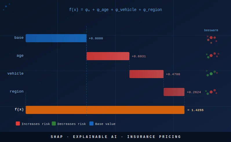
6) Waterfall plot: decomposing one policy's premium
The waterfall plot is the most immediately useful SHAP visualisation for regulatory and actuarial audiences: it shows, for a single policy, how each feature's SHAP value adds to or subtracts from the base value to arrive at the final log-prediction. It is the direct XGBoost equivalent of reading a GLM rate table for a specific policy combination.
Let us pick the most instructive policy: a young driver (18–25), sport vehicle, urban region. This is the highest-risk combination in our data — all three factors have above-average relativities — and the waterfall plot will visually confirm that SHAP correctly attributes the elevated predicted frequency to each factor in proportion to its true contribution.
Because we used one-hot encoding, each original factor (age_group, vehicle_type, region) is spread across multiple dummy columns. Before plotting, we aggregate the SHAP values across dummies belonging to the same factor. This is the step that converts a 17-column SHAP vector into a 3-column actuarial contribution table:
# Find a high-risk policy: 18-25 year old, sport vehicle, urban
iloc_idx = np.where(
    (test['age_group'].values    == '18-25') &
    (test['vehicle_type'].values == 'sport') &
    (test['region'].values       == 'urban')
)[0][0]

sv_policy = shap_values[iloc_idx]

# Aggregate one-hot SHAP back to original features
def aggregate_shap(sv, feature_names, original_features):
    """Sum SHAP values for all dummies belonging to each original feature."""
    result = {}
    for feat in original_features:
        idxs = [i for i, c in enumerate(feature_names) if c.startswith(feat + '_')]
        result[feat] = sv[idxs].sum()
    return result

feat_shap = aggregate_shap(sv_policy, list(X_train.columns), X_cols)
pred_log  = expected_value + sum(feat_shap.values())
pred_rate = np.exp(pred_log)

print("=" * 55)
print(f"Policy: 18-25 | sport | urban")
print("=" * 55)
print(f"Base value        : {expected_value:+.4f}  →  rate {np.exp(expected_value):.5f}")
for feat, val in feat_shap.items():
    print(f"  SHAP({feat:<14}): {val:+.4f}  →  x{np.exp(val):.3f} relativity")
print(f"Prediction (log)  : {pred_log:+.4f}  →  rate {pred_rate:.5f}")
print(f"Portfolio average :               rate {np.exp(expected_value):.5f}")
print(f"Risk ratio vs avg :               {pred_rate / np.exp(expected_value):.2f}x")
The printed output reads exactly like an actuarial rate build-up table: start with the base rate, multiply by the relativity for each factor, and arrive at the policy rate. SHAP on the log scale corresponds exactly to an additive decomposition of the log-rate, which in turn corresponds to a multiplicative decomposition of the rate itself — the same structure as a GLM tariff. This is why SHAP is particularly natural for Poisson insurance models.
# Matplotlib waterfall plot
fig, ax = plt.subplots(figsize=(9, 4))
labels  = ['Base'] + list(feat_shap.keys()) + ['Prediction']
values  = [expected_value] + list(feat_shap.values()) + [0]
running = expected_value

for i, (lab, val) in enumerate(zip(labels[1:-1], values[1:-1])):
    color = '#e53935' if val > 0 else '#43a047'
    ax.barh(lab, val, left=running, color=color, height=0.5, edgecolor='white')
    ax.text(
        running + val + (0.005 if val > 0 else -0.005), i,
        f'{val:+.3f}  (x{np.exp(val):.3f})',
        va='center', ha='left' if val > 0 else 'right', fontsize=9
    )
    running += val

ax.axvline(expected_value, color='#1565c0', linestyle='--', linewidth=1.2,
           label=f'Base {expected_value:.3f}')
ax.axvline(pred_log, color='#e65100', linestyle='--', linewidth=1.2,
           label=f'Pred {pred_log:.3f} (rate {pred_rate:.4f})')
ax.set_xlabel('SHAP value (log scale)', fontsize=10)
ax.set_title('Waterfall: 18-25 | sport | urban — policy rate decomposition', fontsize=11)
ax.legend(fontsize=9)
plt.tight_layout()
plt.savefig('shap_waterfall_policy.png', dpi=150, bbox_inches='tight')
plt.close()
print("Saved: shap_waterfall_policy.png")For a policy that combines three above-average risk factors, the waterfall will show three red bars all pointing right. For a rural, middle-aged, sedan driver, all three bars would be green (or near zero). This visual structure makes the SHAP decomposition immediately intuitive to non-technical audiences — far more so than reading a coefficient table.
7) Beeswarm plot: portfolio-level feature impact
The waterfall plot explains one policy. The beeswarm plot (also called the SHAP summary dot plot) explains the entire portfolio simultaneously. Each row in the beeswarm corresponds to one feature; each dot in a row corresponds to one observation. The horizontal position of a dot is the SHAP value for that feature for that observation. The colour of the dot encodes the feature value — for numeric features, red means high and blue means low; for one-hot dummies, red means the dummy is 1 (that category is active) and blue means the dummy is 0.
The beeswarm is the portfolio-level evidence that SHAP needs to present to a regulator: it shows not just that sport vehicles have a high average SHAP value, but the full distribution of the SHAP attribution across all policies. For a clean model with no overfitting, the distribution should be a tight bimodal: one cluster at the dummy-is-0 SHAP value and one at the dummy-is-1 SHAP value. Wide dispersion within a single category would indicate that the XGBoost model is capturing interactions with other features, which is precisely the kind of non-linearity a GLM cannot model.
# Summary dot plot (beeswarm)
shap.summary_plot(shap_values, X_test, plot_type='dot',
                  feature_names=list(X_train.columns), show=False)
plt.title('SHAP Beeswarm — XGBoost Poisson Frequency (test set)', fontsize=12)
plt.tight_layout()
plt.savefig('shap_beeswarm.png', dpi=150, bbox_inches='tight')
plt.close()

# Global importance bar plot (mean |SHAP|)
shap.summary_plot(shap_values, X_test, plot_type='bar',
                  feature_names=list(X_train.columns), show=False)
plt.title('SHAP Global Importance — mean |SHAP value| across test set', fontsize=12)
plt.tight_layout()
plt.savefig('shap_bar.png', dpi=150, bbox_inches='tight')
plt.close()

print("Saved: shap_beeswarm.png, shap_bar.png")age_group_18-25, vehicle_type_sport) appears as a separate row. For a binary dummy, you will see two distinct clusters: a left cluster (SHAP value is negative or near zero, dummy = 0, blue dots) and a right cluster (SHAP value positive, dummy = 1, red dots). The horizontal gap between the two clusters is the effect of being in that category vs. not being in it. A wide gap means a strong effect; a narrow gap means a weak effect. Features are ordered by mean |SHAP|, so the most impactful factors appear at the top.
The global importance bar plot (mean |SHAP| across all test observations) gives the SHAP-based variable importance ranking. Unlike XGBoost's built-in feature importance metrics (gain, cover, weight), the SHAP-based importance has a natural unit (expected |contribution| to the log-prediction) and satisfies the consistency property: if a feature's true contribution increases (by changing the model), its SHAP importance is guaranteed to increase or stay the same. The built-in XGBoost importance metrics do not have this guarantee, which is one reason regulators prefer SHAP-based importance for model documentation.
In your model documentation, include both the beeswarm and the bar plot. The bar plot gives management the headline ranking; the beeswarm gives the regulator the evidence that the effects are monotone (or explains why they are not). A non-monotone beeswarm for a factor where monotonicity is expected (e.g., young drivers should always have higher frequency than middle-aged drivers) is a red flag that the model has overfit or that the training data has a confound.
8) Dependence plots: discovering non-linear effects and interactions
The SHAP dependence plot goes one level deeper than the beeswarm: for a single feature, it plots the SHAP value (y-axis) against the feature's raw value (x-axis) for every observation in the test set. The result is a scatter plot where the shape of the point cloud reveals the relationship the model has learned. A flat horizontal line means no effect. A linear slope means a monotone effect. A curve means a non-linear effect. Clustering or vertical spread at a given x value means that an interaction with another feature is modulating the effect.
SHAP dependence plots also support a second feature for colouring, which makes interactions visible. In the example below, we colour the sport vehicle dependence plot by the age_18-25 dummy. If young drivers who own sport vehicles receive an additional premium bump beyond what the sport vehicle dummy alone would predict, the red dots (age_18-25 = 1) will be systematically higher than the blue dots (age_18-25 = 0) at the sport vehicle = 1 x-position. This is a SHAP interaction effect.
# Dependence plot: sport vehicle effect, coloured by 18-25 age dummy
sport_idx = list(X_train.columns).index('vehicle_type_sport')
age_idx   = list(X_train.columns).index('age_group_18-25')

shap.dependence_plot(
    sport_idx, shap_values, X_test.values,
    feature_names=list(X_train.columns),
    interaction_index=age_idx,
    show=False
)
plt.title('Dependence: sport vehicle SHAP x 18-25 age interaction', fontsize=11)
plt.tight_layout()
plt.savefig('shap_dependence_sport_age.png', dpi=150, bbox_inches='tight')
plt.close()

# Dependence plot: age_18-25 effect, coloured by sport vehicle
shap.dependence_plot(
    age_idx, shap_values, X_test.values,
    feature_names=list(X_train.columns),
    interaction_index=sport_idx,
    show=False
)
plt.title('Dependence: 18-25 age SHAP x sport vehicle interaction', fontsize=11)
plt.tight_layout()
plt.savefig('shap_dependence_age_sport.png', dpi=150, bbox_inches='tight')
plt.close()

print("Saved: shap_dependence_sport_age.png, shap_dependence_age_sport.png")For regulatory documentation, dependence plots serve a specific purpose: they let a regulator verify that the model's learned effect for each rating factor is consistent with actuarial expectations and with the insurer's rate justification. If the dependence plot for age shows a U-shape (lowest frequency for middle-aged drivers, higher for young and elderly) consistent with the insurer's prior rate justification, that is evidence the model is well-behaved. If the shape contradicts the prior justification — for example, if the 65+ group has a lower SHAP than the 36–50 group in a market where elderly drivers are known to be higher-risk — it warrants investigation.
9) The SHAP contribution table: speaking an actuary's language
The ultimate goal of SHAP documentation for insurance pricing is to produce a table that looks exactly like a GLM rate relativity table: one row per policy, one column per rating factor, each cell containing the factor's multiplicative contribution to the predicted rate for that policy. This table is what a regulator can audit, what an underwriter can verify, and what a policyholder can be shown if they dispute their premium.
Producing this table requires aggregating the one-hot SHAP values back to the original factors (summing dummies), exponentiating to convert from log-scale SHAP to multiplicative relativities, and merging in the original factor values for readability. The following code produces the full contribution table for the test set:
# Aggregate SHAP values from dummies back to original factors
shap_agg = pd.DataFrame(index=test.index)
shap_agg['base_value'] = expected_value

for feat in X_cols:
    idxs = [i for i, c in enumerate(X_train.columns) if c.startswith(feat + '_')]
    shap_agg[f'shap_{feat}'] = shap_values[:, idxs].sum(axis=1)

shap_agg['log_prediction'] = (
    shap_agg['base_value'] +
    shap_agg[[f'shap_{f}' for f in X_cols]].sum(axis=1)
)
shap_agg['predicted_rate'] = np.exp(shap_agg['log_prediction'])

# Convert additive log-SHAP to multiplicative relativity
for feat in X_cols:
    shap_agg[f'rel_{feat}'] = np.exp(shap_agg[f'shap_{feat}'])

# Add original factor values for readability
for feat in X_cols:
    shap_agg[feat] = test[feat].values

# Report columns
report_cols = (
    X_cols +
    [f'rel_{f}' for f in X_cols] +
    ['base_value', 'predicted_rate']
)
print(shap_agg[report_cols].head(8).round(3).to_string())

# Export for model documentation
shap_agg[report_cols].round(4).to_csv('shap_contribution_table.csv', index=False)
print("\nFull table saved to shap_contribution_table.csv")
The output table has columns: age_group, vehicle_type, region, rel_age_group, rel_vehicle_type, rel_region, base_value, predicted_rate. The structure is identical to a GLM rate table. The key difference from a GLM is that in a GLM, all policies with vehicle_type='sport' would have exactly the same rel_vehicle_type — the exponentiated GLM coefficient. In the XGBoost SHAP table, different policies with vehicle_type='sport' may have slightly different rel_vehicle_type values because XGBoost captures interactions between vehicle type and other factors. This is a feature, not a bug — it is the source of XGBoost's higher predictive accuracy — but it requires explanation when presenting to a regulator who expects uniform factor relativities.
sport_avg_shap = shap_agg.loc[test['vehicle_type']=='sport', 'shap_vehicle_type'].mean()sport_relativity = np.exp(sport_avg_shap)This gives the average multiplicative loading for sport vehicles relative to the model base, averaged across all sport vehicle policies. It is directly comparable to the GLM coefficient for sport vehicle, and a regulator can verify it is consistent with the observed loss ratios for sport vehicles.
The contribution table also enables a powerful audit workflow: for any policy that a policyholder or regulator disputes, you can produce a personalised rate explanation letter that says: "Your base rate is X. Your age group adds Y% to your rate. Your vehicle type adds Z%. Your region adds W%. Your total rate is X × (1+Y/100) × (1+Z/100) × (1+W/100) = final rate." This is exactly the same letter an insurer using a GLM can produce — but now it is produced by an XGBoost model with measurably better predictive performance.
10) Presenting SHAP to a regulator or management committee
A model governance dossier built on SHAP should include a standard set of artefacts, produced at each model training run and version-controlled alongside the model weights. The following checklist has been compiled from EIOPA's big data analytics guidelines, ACPR's governance framework, and practical experience with EU insurance regulators in France, Germany, and the Netherlands:
- Base value documentation. State explicitly: "The model base value is [X] on the log scale, corresponding to a predicted frequency of [exp(X)] claims per policy-year. This is the model's expected output for a policy whose features are all at their training-set mean." A table showing base value stability across model retraining runs builds regulator confidence.
- Per-policy SHAP contribution table. Provide a signed contribution per rating factor for every policy in the in-force portfolio. The table format: factor name, factor level, SHAP value (log scale), SHAP relativity (exponentiated), predicted rate. Confirm in a footnote that contributions sum to the log-prediction for every policy (additivity proof).
- Additivity proof. Include a validation summary: "For all [N] policies in the in-force portfolio, the maximum absolute difference between log(model prediction) and base value + sum of SHAP contributions is [X], demonstrating exact decomposition to machine-precision accuracy."
- Relativity view per factor. For each factor level (e.g., sport vehicle), report the average SHAP relativity (exp(mean SHAP)) across all in-force policies with that factor level. Compare these average SHAP relativities to the corresponding GLM rate relativities and flag any divergence exceeding a threshold (e.g., 5%).
- Monotonicity evidence. For each rating factor where actuarial judgment requires a monotone relationship (e.g., young drivers ≥ middle-aged drivers in frequency), include the beeswarm plot and a quantitative check: the fraction of the portfolio for which the SHAP value for age_18-25 exceeds the SHAP value for age_36-50, computed within matched vehicle-type and region cells.
- Global importance ranking per model version. The mean |SHAP| bar plot with the numerical values in a table. This ranking should be stable across retraining runs — large changes in the ranking between two consecutive model versions are a signal of data quality issues or structural changes in the portfolio.
- Interaction documentation. If the SHAP dependence plots reveal material interactions (e.g., the sport vehicle effect is larger for young drivers than for middle-aged drivers), document those interactions explicitly and justify them with loss experience data.
When presenting to a management committee (as opposed to a regulator), the emphasis shifts from completeness to narrative. The beeswarm plot often works well as a single slide: it shows the full portfolio in one visual, it ranks factors by importance, and it makes the direction of each effect immediately obvious. Supplement it with two or three example waterfall plots — one for the highest-risk policy combination, one for the lowest-risk, one for a typical middle-risk policy — to make the SHAP decomposition concrete. A pricing committee that sees how XGBoost SHAP values translate directly into the same multiplicative structure as the GLM they already understand will be much more receptive to approving the model.
11) Monotonicity constraints: SHAP's operational complement
SHAP values document what a model has learned. Monotonicity constraints prevent the model from learning things it should not. In insurance pricing, there are rating factors for which both actuarial judgment and regulatory expectation require a monotone relationship: young drivers should not have lower predicted frequency than middle-aged drivers at any point in the feature space; higher deductible policies should not receive higher predicted frequency; newer vehicles should not receive higher theft frequency than older vehicles. Without monotonicity constraints, XGBoost is free to learn any non-monotone pattern that reduces training deviance, including spurious ones that arise from sampling noise.
XGBoost's monotone_constraints parameter enforces monotonicity at the split level: at each node, the algorithm only considers splits that preserve the constraint. The constraint must be specified for each column in the feature matrix. For one-hot dummies, this is awkward (the constraint is on the original ordinal feature, not the dummies), so we switch to an ordinal encoding for the age factor in the monotone model:
# Ordinal-encoded age for monotonicity
age_order = {'18-25': 0, '26-35': 1, '36-50': 2, '51-65': 3, '65+': 4}
train2    = train.copy()
test2     = test.copy()
train2['age_ord'] = train['age_group'].map(age_order)
test2['age_ord']  = test['age_group'].map(age_order)

X_cols2  = ['age_ord', 'vehicle_type', 'region']
X_train2 = pd.get_dummies(train2[X_cols2], drop_first=False)
X_test2  = pd.get_dummies(test2[X_cols2], drop_first=False).reindex(
               columns=X_train2.columns, fill_value=0)

# Find the column index of age_ord (the only numeric column)
age_col_pos = list(X_train2.columns).index('age_ord')
n_cols      = len(X_train2.columns)

# Constraint: -1 means model must be non-increasing in age_ord
# (lower age_ord = younger = higher risk = higher frequency → non-increasing as age_ord increases)
constraints       = [0] * n_cols
constraints[age_col_pos] = -1

params_mono = {**params, 'monotone_constraints': tuple(constraints)}

dtrain2    = xgb.DMatrix(X_train2, label=train2['claim_count'], weight=train2['exposure'])
dtest2     = xgb.DMatrix(X_test2,  label=test2['claim_count'],  weight=test2['exposure'])
model_mono = xgb.train(
    params_mono, dtrain2,
    num_boost_round=300,
    evals=[(dtrain2, 'train'), (dtest2, 'eval')],
    early_stopping_rounds=30,
    verbose_eval=False
)

# Verify monotonicity: average predicted frequency by age group
age_labels = ['18-25', '26-35', '36-50', '51-65', '65+']
for i, age in enumerate(age_labels):
    mask    = test2['age_group'] == age
    submat  = X_test2[mask]
    preds   = model_mono.predict(xgb.DMatrix(submat)) / test2.loc[mask, 'exposure'].values
    print(f"{age}: mean predicted freq = {preds.mean():.5f}")
# Output should be strictly non-increasing (or nearly so) from 18-25 to 51-65, then up at 65+

print("\nMonotone model trained. Age effect is now guaranteed non-increasing with age ordinal.")In practice, the monotonicity constraint imposes a small but measurable cost in predictive accuracy (Gini or Poisson deviance), because the constraint prevents the model from fitting any genuine non-monotonicities in the training data (which may reflect true risk patterns, or may be sampling noise). The trade-off is a deliberate regulatory and actuarial choice: accept a slightly lower Gini in exchange for a model that is guaranteed never to produce a counter-intuitive age effect. For most regulatory filings, this is the correct trade-off — the Gini loss is typically less than 0.5 percentage points, and the regulatory benefit is a guarantee that no young driver will ever be priced below a middle-aged driver.
12) Limits of SHAP
SHAP is a powerful and mathematically principled tool, but it has limits that any actuary using it for regulatory documentation must understand. Conflating SHAP values with causal effects, or treating SHAP as a complete solution to model explainability, are errors that can undermine a regulatory submission.
Correlated features. When two features are highly correlated — for example, if young drivers in the training data overwhelmingly own sport vehicles — SHAP cannot cleanly separate their contributions. Conditional TreeExplainer (the default) computes the marginal contribution of each feature given the others, which for correlated features can mean that removing sport vehicle information does not change the prediction much (because age still carries most of the signal). The result is that the sport vehicle SHAP value may be smaller than its true causal effect, and the age SHAP value larger. This is not a bug — it is the statistically correct answer to the question "how much does knowing sport vehicle improve the prediction, given that we already know age?" — but it does not reflect the causal loading for sport vehicles. For regulatory documentation in markets where rate relativities are supposed to reflect causal loadings (as opposed to incremental predictive contributions), this distinction matters. Mitigant: use partial dependence SHAP or the interventional approach with a background dataset drawn from the marginal distribution of each feature independently.
One-hot dummy multicollinearity. The one-hot dummies for a single categorical factor are perfectly multicollinear (they sum to 1). This is a non-issue for our workflow because we aggregate dummies back to the original factor. The individual dummy SHAP values do carry the multicollinearity, but since we never present them individually — only the aggregated factor SHAP — this does not affect the output.
shap_interaction_values() call) capture the pairwise interaction terms. For clean three-factor data without interactions in the true data-generating process, the approximation error is negligible. For real portfolios with many interacting factors, the error can be measurable. Always verify: does $e^{\phi_0} \prod_j e^{\phi_j}$ agree with the model's predicted rate to within 1%? If not, compute and include SHAP interaction values in your documentation.
SHAP is local, not causal. SHAP values explain a specific prediction — they answer "why did this model produce this output for this input?" They do not answer "what would happen to the claim frequency if this driver switched from a sedan to a sport vehicle?" That is a causal question, and answering it requires either a causal model (e.g., a structural equation model with instrumental variables) or a controlled experiment. In insurance pricing, the distinction rarely matters for regulatory compliance — regulators want an audit trail of the rating algorithm, not a causal analysis — but it matters for pricing strategy decisions such as "should we rate sport vehicles more aggressively?"
SHAP does not detect discrimination. A high SHAP value for age_group does not tell you whether age is a protected characteristic in your jurisdiction, whether the model produces disparate impact on a protected group, or whether the model is fair. Those are separate analytical questions that require adverse impact ratio analysis, counterfactual fairness testing, and legal review. SHAP is necessary but not sufficient for regulatory compliance on fairness. In the EU, the AI Act and GDPR impose separate fairness requirements that SHAP alone does not address.
SHAP is not model validation. A model with a beautiful SHAP documentation can still be poorly calibrated, overfitted, or based on a non-representative training sample. SHAP documentation belongs in the explainability section of a model governance dossier; it does not replace the validation section (which should include calibration tests, backtesting on held-out policy years, and out-of-time Gini measurement). A regulator who sees only SHAP outputs and no validation statistics will correctly conclude that the documentation is incomplete.
13) Alternatives: LIME, ICE plots, and PDP
SHAP is not the only explainability tool available, and it is worth understanding how the alternatives differ so you can choose the right tool for each communication objective. LIME, ICE plots, and PDPs each have their strengths and are better suited for specific use cases.
LIME (Local Interpretable Model-agnostic Explanations) — Ribeiro et al. (2016) — perturbs an observation by randomly sampling nearby inputs, collects the model's predictions at those perturbed inputs, and fits a local linear regression (or other sparse model) to the perturbed predictions. The coefficients of the local linear model are the LIME feature attributions. LIME is model-agnostic (it works with any black box) and conceptually simple. Its limitation for regulatory use is that it is not consistent: the same model and the same observation can yield different LIME values on different runs (because the perturbation sample is random), and LIME does not satisfy the Shapley axioms. For individual policy documentation — where you need exactly reproducible values — LIME is unsuitable. It is better suited for exploration and debugging than for formal governance documentation.
ICE plots (Individual Conditional Expectation) — Goldstein et al. (2015) — take a different approach: instead of attributing the prediction to features, they show how the prediction changes as you sweep one feature across its range, holding all others fixed at their observed values, for each individual observation. The result is a set of curves (one per observation) showing the model's sensitivity to one feature. ICE plots are highly intuitive — they do not require understanding Shapley values — and they directly answer questions like "how does my model price sport vehicles differently from sedans, for a 30-year-old urban driver?" Their limitation is that they do not decompose the prediction (they show the effect of a feature, not its attribution), and they become cluttered for large test sets.
# Partial Dependence Plot: manual implementation for XGBoost
# (shows mean prediction as we sweep age_group, holding other factors constant)
age_labels = ['18-25', '26-35', '36-50', '51-65', '65+']
pdp_preds  = []

for age in age_labels:
    X_pdp = X_test.copy()
    # Zero out all age dummies and activate the target one
    for col in X_pdp.columns:
        if col.startswith('age_group_'):
            X_pdp[col] = 0
    if f'age_group_{age}' in X_pdp.columns:
        X_pdp[f'age_group_{age}'] = 1
    # Predict count and divide by exposure to get frequency
    preds = model.predict(xgb.DMatrix(X_pdp)) / test['exposure'].values
    pdp_preds.append(preds.mean())

plt.figure(figsize=(7, 4))
plt.plot(age_labels, pdp_preds, 'o-', color='#1565c0', linewidth=2, markersize=8)
plt.xlabel('Age group', fontsize=11)
plt.ylabel('Mean predicted frequency (annualised)', fontsize=11)
plt.title('Partial Dependence Plot: age_group effect (XGBoost Poisson)', fontsize=12)
plt.grid(axis='y', alpha=0.3)
plt.tight_layout()
plt.savefig('pdp_age.png', dpi=150, bbox_inches='tight')
plt.close()
print("Saved: pdp_age.png")
PDP (Partial Dependence Plot) — Friedman (2001) — is the average of ICE curves across the dataset. It shows the marginal expected prediction as a function of one feature, averaging out the other features over their empirical distribution. PDPs are excellent for communication with non-technical audiences because they reduce the visual complexity of ICE to a single curve. Their weakness is that averaging can mask interactions: if the age effect is very different for sport-vehicle drivers vs sedan drivers, the PDP will show an average that represents neither group accurately. PDPs also assume feature independence in their marginalisation — sweeping age while averaging over vehicle type assumes the distribution of vehicle type is the same for all ages, which is often false. SHAP dependence plots are generally preferable to PDPs precisely because they condition on the observed feature distribution rather than marginalizing over it.
SHAP interaction values extend the standard SHAP framework to decompose predictions into main effects and pairwise interaction effects. The call explainer.shap_interaction_values(X_test) returns an array of shape $(n, p, p)$ where position $(i, j, k)$ is the SHAP interaction value for features $j$ and $k$ for observation $i$. The main effect for feature $j$ is on the diagonal: shap_interaction_values[i, j, j]. The interaction between features $j$ and $k$ is split symmetrically between off-diagonal entries: shap_interaction_values[i, j, k] = shap_interaction_values[i, k, j]. For regulatory documentation, interaction values are optional unless the beeswarm or dependence plots suggest material interactions that need formal attribution.
- Regulator (individual policy audit): SHAP waterfall plot + SHAP contribution table
- Regulator (portfolio documentation): Beeswarm + bar plot + average SHAP relativity table
- Management committee: Beeswarm (one slide) + three example waterfall plots
- Underwriter checking a specific risk: SHAP contribution table for that policy
- Actuary investigating a specific factor: SHAP dependence plot for that factor
- Policyholder complaint response: Personalised waterfall in plain language
- Model debugging: ICE plots + SHAP dependence plots
- Feature selection: Mean |SHAP| bar plot
14) References
- Lundberg, S. M., & Lee, S. I. (2017). A Unified Approach to Interpreting Model Predictions. Advances in Neural Information Processing Systems (NeurIPS 2017).
- Lundberg, S. M., Erion, G., Chen, H., DeGrave, A., Prutkin, J. M., Nair, B., ... & Lee, S. I. (2020). From local explanations to global understanding with explainable AI for trees. Nature Machine Intelligence, 2(1), 56–67.
- EIOPA (2019). Guidelines on the Use of Big Data Analytics by Insurers and Intermediaries. European Insurance and Occupational Pensions Authority.
- EU AI Act (2024). Regulation (EU) 2024/1689 of the European Parliament and of the Council of 13 June 2024 laying down harmonised rules on artificial intelligence. Annex III (high-risk AI systems), Article 13 (transparency obligations).
- ACPR (2020). Gouvernance des algorithmes d'apprentissage automatique utilisés dans le secteur financier. Autorité de Contrôle Prudentiel et de Résolution.
- FCA (2021). Artificial Intelligence and Machine Learning in Financial Services. Discussion Paper DP21/4. Financial Conduct Authority.
- Chen, T., & Guestrin, C. (2016). XGBoost: A Scalable Tree Boosting System. Proceedings of the 22nd ACM SIGKDD International Conference on Knowledge Discovery and Data Mining.
- Frees, E. W. (2014). Regression Modeling with Actuarial and Financial Applications. Cambridge University Press.
- De Jong, P., & Heller, G. Z. (2008). Generalized Linear Models for Insurance Data. Cambridge University Press.
- Ribeiro, M. T., Singh, S., & Guestrin, C. (2016). "Why should I trust you?": Explaining the predictions of any classifier. Proceedings of the 22nd ACM SIGKDD.
- Goldstein, A., Kapelner, A., Bleich, J., & Pitkin, E. (2015). Peeking inside the black box: Visualizing statistical learning with plots of individual conditional expectation. Journal of Computational and Graphical Statistics, 24(1), 44–65.
- SHAP documentation: TreeExplainer API, plot gallery, and theoretical background.
- XGBoost documentation: full parameter reference, Poisson objective, and monotonicity constraints.
15) Glossary
- SHAP (SHapley Additive exPlanations)
- A framework that assigns each feature a Shapley value — its average marginal contribution to the prediction across all possible feature orderings. Satisfies Efficiency, Symmetry, Dummy, and Linearity axioms.
- Shapley value
- From cooperative game theory (Shapley, 1953): the unique fair payoff to player $j$ given a characteristic function $v(S)$ that measures the coalition's combined payoff. In SHAP, players are features and payoffs are prediction contributions.
- TreeExplainer
- The SHAP algorithm optimised for tree-based models (XGBoost, LightGBM, CatBoost, scikit-learn forests). Computes exact Shapley values in $O(TLD^2)$ time by exploiting the tree structure. No sampling, no approximation.
- Base value ($\phi_0$)
- The model's mean prediction over the dataset the explainer was initialised on, expressed on the link function scale (log scale for Poisson XGBoost). The efficiency axiom guarantees: $\phi_0 + \sum_j \phi_j = \hat{f}(x)$.
- Waterfall plot
- A visualisation of how SHAP values additively compose to form a specific prediction. Each bar represents one feature's SHAP contribution, starting where the previous bar ended. Begins at the base value and ends at the model prediction.
- Beeswarm plot
- A portfolio-level scatter of SHAP values, with one dot per observation per feature, positioned horizontally by SHAP value and coloured by feature value (red = high, blue = low for numeric; red = active, blue = inactive for dummies). Features ordered by mean |SHAP|.
- Dependence plot
- A scatter of SHAP value for feature $j$ (y-axis) vs. its raw value (x-axis), coloured by a second interaction feature. The shape of the point cloud reveals the model's learned effect for that feature and any interactions with the colouring feature.
- Monotonicity constraint
- A parameter passed to XGBoost that forces a feature's effect on the prediction to be non-decreasing (+1) or non-increasing (−1) as its value increases. Enforced at each tree split; the constraint is guaranteed to hold for all predictions, not just on average.
- ICE plot (Individual Conditional Expectation)
- A plot of model prediction vs. one feature's value, computed by sweeping that feature across its range while holding all other features at their observed values for a specific observation. One curve per observation; the average ICE is the PDP.
- PDP (Partial Dependence Plot)
- The marginal expected prediction as a function of one feature, computed by averaging ICE curves across the dataset. Marginalises over the empirical distribution of other features. Equivalent to the mean ICE; shows the average effect of one feature, not the per-observation effect.
- LIME (Local Interpretable Model-agnostic Explanations)
- An explanation method that perturbs an input, collects model predictions at the perturbed inputs, and fits a local linear surrogate. Model-agnostic but not consistent — different random seeds yield different explanations for the same model and input.
- SHAP interaction values
- An extension of SHAP that decomposes each SHAP value into a main effect and pairwise interaction effects. Returns an $(n, p, p)$ array. Main effects on the diagonal, symmetric pairwise interactions on the off-diagonal.
- Interventional vs conditional expectation
- Two interpretations of the coalition value function $v(S)$ in SHAP. Conditional: missing features are drawn from their conditional distribution given the observed features (default, exact for TreeExplainer). Interventional: missing features are drawn from their marginal distribution independently (requires background dataset, avoids spurious correlation effects).
16) FAQ
Q1. Are SHAP values on the response scale (rates) or the log scale?
For XGBoost with objective='count:poisson', TreeExplainer returns SHAP values on the log scale (the link function scale). The base value $\phi_0$ is the mean log-prediction over the dataset the explainer was initialised on. The efficiency axiom holds on the log scale: $\phi_0 + \sum_j \phi_j = \log(\hat{y})$. To convert to approximate multiplicative relativities, exponentiate each SHAP value: $\text{relativity}_j = e^{\phi_j}$. Note this is approximate when XGBoost has learned interactions between features (the exact decomposition would require SHAP interaction values). For the simulated portfolio in this article with three clean non-interacting factors, the approximation is essentially exact.
Q2. Can I use SHAP for the GLM as well?
Yes, via shap.LinearExplainer. But for a GLM with a log link, the SHAP values are simply the GLM coefficients multiplied by the feature values (on the one-hot-encoded matrix), which is just the standard linear predictor decomposition. SHAP adds nothing analytically new to a GLM — the GLM's coefficient table is already an exact additive decomposition of the log-prediction. Where SHAP does add value for GLMs is in providing a common framework for comparing GLM and XGBoost explanations side by side. If you run LinearExplainer on the GLM and TreeExplainer on XGBoost, you can produce a single beeswarm-style comparison plot that shows, for each factor, how the GLM's SHAP value (constant across all policies with the same factor level) compares to the XGBoost SHAP value (which varies across policies due to interactions). This comparison plot is very effective for communicating to a management committee why XGBoost has higher Gini — the variation in XGBoost SHAP values that is absent in GLM SHAP values is exactly the interaction signal the GLM cannot capture.
Q3. How many observations do I need in my background dataset for TreeExplainer?
If you use the default conditional expectation mode (no background dataset), none. TreeExplainer with conditional expectations computes exact Shapley values without a background dataset. If you use the interventional mode (feature_perturbation='interventional'), you need a background dataset to marginalise out missing features. The shap library recommends 100 to 1,000 observations drawn from the training set. Larger backgrounds reduce variance in the marginalisation but increase compute time approximately linearly. For a portfolio with 500,000 in-force policies and 15 rating factors, 500 background observations is a reasonable default. Use shap.sample(X_train, 500) to draw a stratified sample if needed.
Q4. Will SHAP work with a CatBoost or LightGBM model?
Yes. Both have dedicated SHAP implementations that are compatible with the shap library. For LightGBM: shap.TreeExplainer(lgbm_model) — identical API, identical interpretation. For CatBoost: either shap.TreeExplainer(cat_model) or the native cat_model.get_feature_importance(type='ShapValues') which returns the $(n, p+1)$ array (p feature SHAP values plus the base value in the last column). CatBoost's native implementation handles categorical features directly without one-hot encoding, which simplifies the aggregation step — you get one SHAP value per categorical feature rather than per dummy column. For insurance pricing with many high-cardinality factors (vehicle make, postcode district), CatBoost with its native categorical handling can significantly simplify the SHAP documentation workflow.
Q5. My regulator asked for "factor-level relativities." How do I produce them from SHAP?
Group policies by factor level, average the SHAP value for that factor, and exponentiate. For example, to compute the SHAP-derived relativity for sport vehicles:
# Average SHAP relativity for sport vehicles
sport_mask        = test['vehicle_type'] == 'sport'
sport_shap_mean   = shap_agg.loc[sport_mask, 'shap_vehicle_type'].mean()
sport_relativity  = np.exp(sport_shap_mean)
print(f"Sport vehicle SHAP relativity: {sport_relativity:.3f}")

# Full factor-level relativity table
for feat in X_cols:
    print(f"\n--- {feat} ---")
    for level in sorted(test[feat].unique()):
        mask     = test[feat] == level
        avg_shap = shap_agg.loc[mask, f'shap_{feat}'].mean()
        rel      = np.exp(avg_shap)
        n_obs    = mask.sum()
        print(f"  {level:<12}: avg SHAP = {avg_shap:+.4f}, relativity = {rel:.3f}  (n={n_obs})")
This produces the factor-level relativity table that a regulator expects. Compare it to the GLM coefficient table: the values should be similar (both are trying to estimate the same true relativities), with the XGBoost SHAP relativities typically closer to the true values for factors with non-linear or interaction effects. Attach this table as Appendix A of your model governance dossier.
- GLMs for P&C Insurance Pricing — A Practical Guide with Python — Poisson frequency and Gamma severity GLMs from scratch, rate relativities, and tariff grids.
- XGBoost vs GLMs for P&C Insurance Pricing: When to Use Which — benchmarking XGBoost against the GLM on Gini and Poisson deviance, plus a decision framework.
- SHAP Values for Explainable Insurance Pricing: Making Black-Box Models Auditable — this article: complete SHAP workflow for regulatory documentation.
Comments